

Introducing



Release at a glance
New & revamped
F.01
Custom Tags User Experience
Revamped
Problem
The previous tag system was limited to simple string values, with no support for typed inputs, structured sections, or AI-populated fields. Navigators frequently encountered data inconsistencies between display and edit modes, and there was no validation on required tag fields.
Impact
Navigators can capture richer, structured patient data with fewer errors. AI-populated tags are clearly distinguished from user-editable ones, reducing confusion and improving data integrity across all sites.
What’s New
Tag Differentiation
Existing tags at patient level vs. newly added tags are now visually distinguished
One-Click Tag Editing
Existing tags can be edited with a simple click directly on the tag
Active Tag Highlighting
The tag currently selected for editing is clearly highlighted so navigators always know what they're modifying
A complete rebuild of the custom tag framework. Tags now trim whitespace, enforce field completion before saving, and correctly reflect the system timezone for date fields. Additional UX improvements to the tag editing experience
Color-Coded Unsaved Changes
Unsaved changes are visible and colour-coded — edits, new additions, and deletions each have a distinct indicator
Smart Add-Tag Button Placement
The + icon to add tags repositions intelligently while editing for ease of use

F.02
Radiology Report with Redesigned View
Problem
The existing report card only displayed the raw report text with no structure around it. As qTrack would start receiving richer metadata alongside reports, there was no way to showcase this data within the same view as navigators had to look elsewhere for context that should be immediately visible alongside the report.
Impact
Navigators can read the report, check its version history, review metadata, and see AI-extracted findings all within a single card without switching views. The layered structure keeps the most critical information immediately visible while progressively revealing detail on demand — reducing cognitive load and speeding up case review.

What’s New
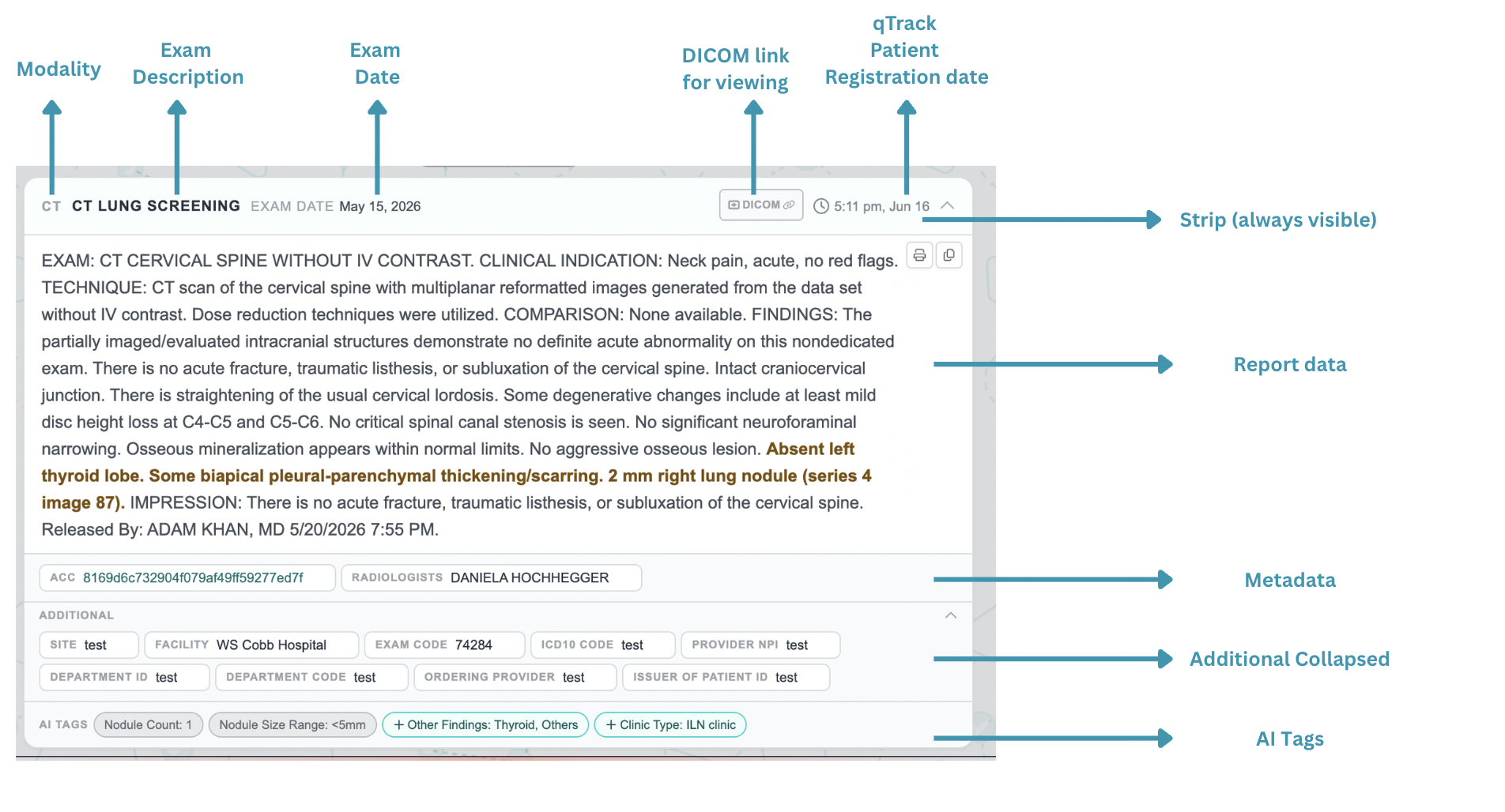
The report card has been redesigned into a structured 6-layer showcase:
Strip (always visible)
Modality, exam description, exam date, and a DICOM button are always shown at the top. The DICOM viewer has moved from a separate navigation field to a button right on the report strip, keeping it contextually tied to the exam it belongs to.
Report Text
The report body is displayed in a clean scrollable area. AI-identified key phrases (nodule findings, recommendations) are highlighted in amber so navigators can scan for critical content at a glance without reading the full report.
Metadata
Key report details are now visible directly on the card as labelled pills: ACC number, Radiologist, Referring Physician, Ordering Physician, Patient Class, and Facility. No separate lookup needed.
Additional (collapsed)
Less-frequently needed fields like Site, Exam Code, Department ID, and Provider NPI are tucked under an expandable "Additional" section — visible when needed, out of the way when not.
AI Tags
AI-extracted tags appear at the bottom of the report card as round pills, visually distinct from the metadata pills above. Grey pills indicate the clinical indication (e.g. lung cancer screening), amber pills flag specific findings (e.g. Nodule Size >8mm)
!
Note on Metadata Field Availability
The metadata fields including Order Date, Diagnostic / Study Type, Ordering Physician, Referring Physician, Report Date, Report Status, Accession ID, and Radiologist may or may not be visible depending on the data currently being sent as part of the integration layer. Coordination with each site's IT team is in progress and outreach emails have been sent. Once the data feed is confirmed and the required fields are being transmitted to qTrack, they will populate automatically in the metadata strip with no further changes needed on the qTrack side.
F.03
EMR Records Section with
New Layout
Problem
The Records section was a single long scrollable list, making it difficult to navigate across multiple appointments or encounters. Navigators had to scroll extensively to find specific record types, and there was no way to see different data categories side by side.
Impact
Navigators can navigate across record types in one click, see more information at a glance, and spend less time scrolling through unrelated records to find what they need. Particularly beneficial on high-volume cases with multiple encounters.

What’s New
Records Section Redesign
The Records section has been restructured from a single scrollable view into 4 sub-sections presented as a ribbon/tab bar right below the Records Section. Each sub-section is scoped to a specific record type, and each tab is designed to surface more data points in a compact layout — so multiple appointments or encounters within a category are visible at once without excessive scrolling.
F.04
Case Snapshot Summary Update
Problem
Navigators while using clinical snapshot had only context from radiology reports and no EMR records
Impact
Navigators get immediate clinical context from both radiology reports and EMR snapshot on opening a case, reducing time-to-review and supporting faster triage and task prioritization.
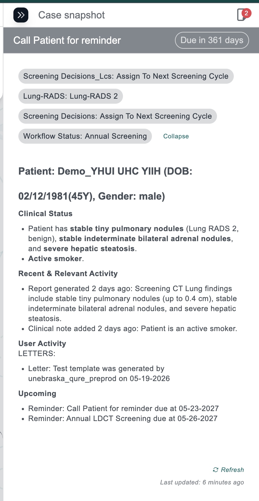
An AI-generated patient summary is now displayed on the case page, automatically triggered for every valid report received. The summary pulls from EMR social history clinical conditions and covers:

What’s New
Smoking history
current/former/never status and if pack years if mentioned or
years since quit
Cancer history
Cancer history and family history of cancer as needed
Co-morbidities
Concise list of all present conditions
DOB Formatting
DOB formatting corrected and any date display standardised
F.05
Patient Record Merge Detection & Resolution
Problem
When two patient records were merged in the EMR (e.g., ED cases or duplicate MRNs consolidated), qTrack had no awareness of this change. Navigators either had to raise manual requests or continued working on split records, leading to duplicate cases, inconsistent tagging, and no visibility into merge events. There was also no mechanism to detect or resolve tag conflicts when both parent and child patients existed independently in qTrack.
Impact
Navigators are automatically redirected from archived/merged patients to the surviving record. Tag data from the child is surfaced for review and merged into the parent rather than being silently lost. Sites with active EMR patient merge activity will see this reflected in qTrack without manual intervention.
Simplified Patient Summary UI
Section icons have been removed from the patient summary UI.
Explicit Date
Display
Relative date references ("today", "tomorrow") are replaced with explicit dates throughout.
Refined LLM Input Handling
The LLM now receives only radiology reports and few EMR datapoints like gender, DOB; Clinical notes including forms, letters, reminders, and demographics are excluded from LLM input and instead rendered deterministically.

What’s New
Manual Sync Trigger
- Users can now trigger a manual patient sync to fetch the latest EMR state in cases where a merge is suspected but not yet reflected.
- This reduces dependency on backend/manual interventions.
EMR Merge Detection
When a patient sync occurs, the system now detects merge signals (FHIR replaces / replaced-by links, ADT-A40 events) and routes them to a new merge handling service
Clear Parent–Child Handling
- The merged (child) patient is automatically marked as archived.
- The retained (parent) patient becomes the single source of truth.
Archived Patient View
When a navigator opens a merged (child) patient:
- The entire UI is greyed out (read-only state)
- A clear “Go to current patient” CTA is shown for redirection
A complete end-to-end patient merge detection and resolution workflow has been introduced:
F.06
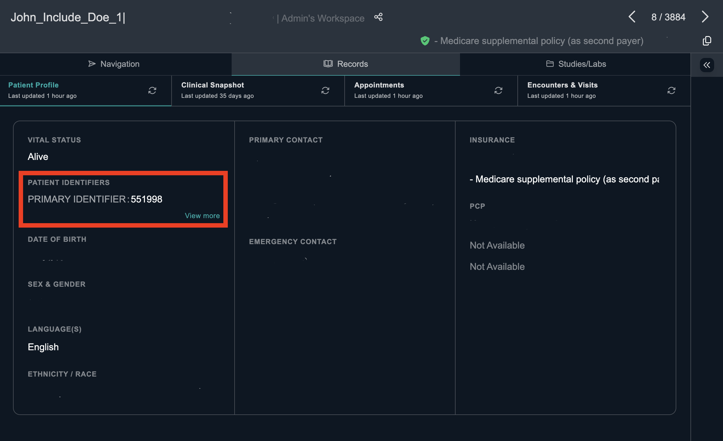
MRN/EMPI is now Primary Identifier under Record Section
Problem
The Records section used varying identifiers to surface patient data, making it harder for navigators to quickly locate and disambiguate records, especially during multi-patient review.
Impact
Faster disambiguation during patient record review. Navigators can immediately cross-reference the correct patient without additional lookups.

What’s New
MRN-First Identification
MRN is now the primary identifier displayed in the Records section. In the Patient Review modal, MRN is also shown for conflicting tags across multiple children during merge review.
Fixes
Bug fixes
01
When a navigator typed a patient name or MRN into the search bar, any previously active saved filter was automatically being applied on top of the search query — silently narrowing the results. For example, if a saved filter scoped to a specific program type was active, searching by MRN would still restrict results to that program, causing the patient to appear missing or unfound even when they existed. Fixed so that searching by patient name or ID runs as a clean, unfiltered lookup, independent of any active saved filter.
02
When a navigator generated a letter, certain fields that should have been automatically filled in from patient demographics, study metadata, exam date, or referring physician data were coming through blank — requiring the navigator to manually enter information that the system already had. The expected behaviour is that all deterministic fields with a known data source populate automatically on letter generation with no manual entry needed. This ticket has been marked Won't Do and is not being actioned in this release.

Introducing



This release focuses on streamlining navigator workflows through improved tag management, enhanced report and case summary experiences, a more intuitive EMR records section, and the introduction of patient record merge functionality.
Release at a glance
New & revamped
F.01
Custom Tags User Experience
Revamped
Problem
The previous tag system was limited to simple string values, with no support for typed inputs, structured sections, or AI-populated fields. Navigators frequently encountered data inconsistencies between display and edit modes, and there was no validation on required tag fields.
Impact
Navigators can capture richer, structured patient data with fewer errors. AI-populated tags are clearly distinguished from user-editable ones, reducing confusion and improving data integrity across all sites.
What’s New
Tag Differentiation
Existing tags at patient level vs. newly added tags are now visually distinguished
One-Click Tag Editing
Existing tags can be edited with a simple click directly on the tag
Active Tag Highlighting
The tag currently selected for editing is clearly highlighted so navigators always know what they're modifying
A complete rebuild of the custom tag framework. Tags now trim whitespace, enforce field completion before saving, and correctly reflect the system timezone for date fields. Additional UX improvements to the tag editing experience
Color-Coded Unsaved Changes
Unsaved changes are visible and colour-coded — edits, new additions, and deletions each have a distinct indicator
Smart Add-Tag Button Placement
The + icon to add tags repositions intelligently while editing for ease of use

F.02
Radiology Report with Redesigned View
Problem
The existing report card only displayed the raw report text with no structure around it. As qTrack would start receiving richer metadata alongside reports, there was no way to showcase this data within the same view as navigators had to look elsewhere for context that should be immediately visible alongside the report.
Impact
Navigators can read the report, check its version history, review metadata, and see AI-extracted findings all within a single card without switching views. The layered structure keeps the most critical information immediately visible while progressively revealing detail on demand — reducing cognitive load and speeding up case review.
What’s New
The report card has been redesigned into a structured 6-layer showcase:
Strip (always visible)
Modality, exam description, exam date, and a DICOM button are always shown at the top. The DICOM viewer has moved from a separate navigation field to a button right on the report strip, keeping it contextually tied to the exam it belongs to.
Report Text
The report body is displayed in a clean scrollable area. AI-identified key phrases (nodule findings, recommendations) are highlighted in amber so navigators can scan for critical content at a glance without reading the full report.
Metadata
Key report details are now visible directly on the card as labelled pills: ACC number, Radiologist, Referring Physician, Ordering Physician, Patient Class, and Facility. No separate lookup needed.
Additional (collapsed)
Less-frequently needed fields like Site, Exam Code, Department ID, and Provider NPI are tucked under an expandable "Additional" section — visible when needed, out of the way when not.
AI Tags
AI-extracted tags appear at the bottom of the report card as round pills, visually distinct from the metadata pills above. Grey pills indicate the clinical indication (e.g. lung cancer screening), amber pills flag specific findings (e.g. Nodule Size >8mm)
!
Note on Metadata Field Availability
The metadata fields including Order Date, Diagnostic / Study Type, Ordering Physician, Referring Physician, Report Date, Report Status, Accession ID, and Radiologist may or may not be visible depending on the data currently being sent as part of the integration layer. Coordination with each site's IT team is in progress and outreach emails have been sent. Once the data feed is confirmed and the required fields are being transmitted to qTrack, they will populate automatically in the metadata strip with no further changes needed on the qTrack side.
F.03
EMR Records Section with
New Layout
Problem
The Records section was a single long scrollable list, making it difficult to navigate across multiple appointments or encounters. Navigators had to scroll extensively to find specific record types, and there was no way to see different data categories side by side.
Impact
Navigators can navigate across record types in one click, see more information at a glance, and spend less time scrolling through unrelated records to find what they need. Particularly beneficial on high-volume cases with multiple encounters.
What’s New
Records Section Redesign
The Records section has been restructured from a single scrollable view into 4 sub-sections presented as a ribbon/tab bar right below the Records Section. Each sub-section is scoped to a specific record type, and each tab is designed to surface more data points in a compact layout — so multiple appointments or encounters within a category are visible at once without excessive scrolling.
F.04
Case Snapshot Summary Update
Problem
Navigators while using clinical snapshot had only context from radiology reports and no EMR records
Impact
Navigators get immediate clinical context from both radiology reports and EMR snapshot on opening a case, reducing time-to-review and supporting faster triage and task prioritization.
An AI-generated patient summary is now displayed on the case page, automatically triggered for every valid report received. The summary pulls from EMR social history clinical conditions and covers:
What’s New
Smoking history
current/former/never status and if pack years if mentioned or
years since quit
Cancer history
Cancer history and family history of cancer as needed
Co-morbidities
Concise list of all present conditions
DOB Formatting
DOB formatting corrected and any date display standardised
F.05
Patient Record Merge Detection & Resolution
Problem
When two patient records were merged in the EMR (e.g., ED cases or duplicate MRNs consolidated), qTrack had no awareness of this change. Navigators either had to raise manual requests or continued working on split records, leading to duplicate cases, inconsistent tagging, and no visibility into merge events. There was also no mechanism to detect or resolve tag conflicts when both parent and child patients existed independently in qTrack.
Impact
Navigators are automatically redirected from archived/merged patients to the surviving record. Tag data from the child is surfaced for review and merged into the parent rather than being silently lost. Sites with active EMR patient merge activity will see this reflected in qTrack without manual intervention.
Simplified Patient Summary UI
Section icons have been removed from the patient summary UI.
Explicit Date
Display
Relative date references ("today", "tomorrow") are replaced with explicit dates throughout.
Refined LLM Input Handling
The LLM now receives only radiology reports and few EMR datapoints like gender, DOB; Clinical notes including forms, letters, reminders, and demographics are excluded from LLM input and instead rendered deterministically.
What’s New
Manual Sync Trigger
- Users can now trigger a manual patient sync to fetch the latest EMR state in cases where a merge is suspected but not yet reflected.
- This reduces dependency on backend/manual interventions.
EMR Merge Detection
When a patient sync occurs, the system now detects merge signals (FHIR replaces / replaced-by links, ADT-A40 events) and routes them to a new merge handling service
Clear Parent–Child Handling
- The merged (child) patient is automatically marked as archived.
- The retained (parent) patient becomes the single source of truth.
Archived Patient View
When a navigator opens a merged (child) patient:
- The entire UI is greyed out (read-only state)
- A clear “Go to current patient” CTA is shown for redirection
A complete end-to-end patient merge detection and resolution workflow has been introduced:
F.06
MRN/EMPI is now Primary Identifier under Record Section
Problem
The Records section used varying identifiers to surface patient data, making it harder for navigators to quickly locate and disambiguate records, especially during multi-patient review.
Impact
Faster disambiguation during patient record review. Navigators can immediately cross-reference the correct patient without additional lookups.
What’s New
MRN-First Identification
MRN is now the primary identifier displayed in the Records section. In the Patient Review modal, MRN is also shown for conflicting tags across multiple children during merge review.
Fixes
Bug fixes
01
When a navigator typed a patient name or MRN into the search bar, any previously active saved filter was automatically being applied on top of the search query — silently narrowing the results. For example, if a saved filter scoped to a specific program type was active, searching by MRN would still restrict results to that program, causing the patient to appear missing or unfound even when they existed. Fixed so that searching by patient name or ID runs as a clean, unfiltered lookup, independent of any active saved filter.
02
When a navigator generated a letter, certain fields that should have been automatically filled in from patient demographics, study metadata, exam date, or referring physician data were coming through blank — requiring the navigator to manually enter information that the system already had. The expected behaviour is that all deterministic fields with a known data source populate automatically on letter generation with no manual entry needed. This ticket has been marked Won't Do and is not being actioned in this release.
03
When editing patient details, the Date of Birth (DOB) shown in the Edit Patient modal was occasionally off by one day compared to the DOB displayed on the patient header. This inconsistency was due to a timezone-related issue in date handling. Fixed so that DOB is now displayed consistently and accurately across both views.